


Exhibitions - Fall 1997
| August 28 - September 27 | Fine Arts Faculty Exhibition |
| October 3 - 31 | Wake Up Little Susie: Pregnancy and Power before Roe v. Wade |
| November 7 - December 12 | Caliban Press: Letterpress Books and Pamphlets, 1985 - 1997 |
Fine Arts Faculty
Exhibition
top of page Best in Show: Photographs
from the
 St. Lawrence University Permanent Collection 65.1.10 This hallway exhibition is drawn from a group of photographs donated to St. Lawrence University in 1965 by Doris Offermann 34. The photographs, many of which were created by amateurs, date from the 1930s to the early 60s and were intended to foster the teaching of photography as a fine art. In these works, difficult and sensitive photographic techniques, such as bromoil transfer, chalking, and carbon color printing, typically emphasized form over content. The exhibition therefore examines the evolving function of a university teaching collection. Many of the photographs represent what are now considered sexist and racist attitudes toward their subjects, perspectives no doubt transparent when they were made but strikingly evident today. These images have become historical documents, marking how aesthetic, philosophical, and political values change over time. Wake Up Little Susie: Pregnancy and Power before Roe v. Wade and Warnings by Lisa Link
Kathy Hutton, Kay Obering, Cathleen Meadows, Wake Up Little
Susie: Pregnancy and Power before Roe v. Wade is a traveling art exhibition
that explores the roles that pregnancy, race and socio-economic class played
in the United States after World War II and before the landmark Roe
v. Wade legislation in 1973. Based on a book of the same title
by Dr. Solinger (Routledge, 1992) the exhibition is specifically designed
to raise questions and encourage dialogue on issues of gender, power, and
politics. However, rather than confront viewers with a perhaps expected
pro-choice message, the exhibition takes an educational and historical
approach to the extremely complex issues surrounding abortion rights in
this country. By focusing on these issues in a cultural and historical
context, the exhibition seeks to help viewers become more informed of current,
highly controversial reproduction and welfare politics and, ultimately,
to become more engaged in the debates surrounding these issues.
Rickie Solinger, visiting professor of Womens Studies at the University of Colorado, Boulder, is a well-known author, speaker, and scholar. Her lecture will address "the arena where contemporary reproductive politics and welfare politics meet," and she will be available for one or two class visits while she is here at St. Lawrence. Additional funding for Wake Up Little Susie and the Solinger lecture is provided by the New York Council for the Humanities and the University's Cultural Affairs Council. Accompanying the Wake-Up installation is an exhibition
of forty computer photomontages and two videos entitled Warnings
by artist Lisa Link. Her images combine photographs and historical
quotations, creating a political message in support of womens rights to
abortion. She writes, "Violent acts of anti-choice groups motivated
me to counteract their aggression with an educational exhibit....
The propaganda techniques of the anti-choice movement made me furious,
equating pro-choice activists with Nazis. The anti-abortionists published
slogans such as Auschwitz, Dachau, Margaret Sanger: Three of a Kind,
Abortion is the American Holocaust, and in response to Dr. David Gunns
murder, Abortion makes the Nazi holocaust pale in contrast. Silence
on the part of those who believe in the right of women to control their
bodies and destinies only serves to erode these precious freedoms."
Caliban Press: Letterpress Books and Pamphlets 1985-1997
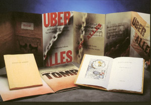 An exhibition of limited edition letterpress books and pamphlets designed, printed and published by Mark McMurray of Caliban Press will be presented in the interior galleries. Publications include works by Jack Kerouac, Diane Wakoski, Daniel Berrigan, and Amiri Baraka as well as books on jazz, space flight, and wood engraving. A graduate of Hamilton College and the School of Library Service at Columbia University, McMurray studied letterpress printing with Red Ozier Press and bookbinding with Timothy C. Ely. Founded in 1985 in Montclair, New Jersey, Caliban Press moved in 1993 to Canton, New York, where McMurray is a librarian at St. Lawrence University. He and English professor Tom Berger will be team-teaching a course this fall entitled Print Culture which will include hands-on workshops in design, composition, typesetting, printing, proofing, and binding. McMurray writes: The process of designing and printing a text -- giving form to voice -- is at once an art, craft, and trade whose goal is to achieve a balance between form and content; it is the process in which the book-object is born. "Were a poem to remain only in the mind of the author, would it actually exist?"* As pure as the words of a poem are in the authors mind, during the act of publication those words are set in a typeface with certain historical and cultural associations (sans-serif, swash capitals, gothic blackletter); printed or displayed by a particular technology (handwritten, letterpress, photo-offset, laser printed); and appear on a paper of a certain weight, color, texture -- or perhaps on no paper at all -- on a clay tablet, animal skin, or computer screen. The physical representation of any text always involves a series of design decisions, all of which subsequently contribute to the readers response to that text. When a text is recited or read aloud, we instantly recognize a voice -- male, female, young, old, high, low. We register a thousand nuances of the human voice. So too, with a type face, although most of us are less aware of typographic nuances until they are pointed out to us. Apart from economic considerations which cause many publishers to view spacious margins as wasted paper, book design today has generally taken two approaches: "crystal goblet" typography in which the physical object of the book is intended to be as invisible as possible, to be legible and yet unobtrusive, existing only as a conduit between author and reader. But how realistic is this approach in an age in which the visual image is paramount? Increasingly designers today rely on an aesthetic which produces a more hands-on allusive design. I have designed books from both points of view. All of these publications are responses to the texts they contain. T hey (both text and container) are presented to the reader for further response. Some have never been printed before, some may never be printed again, and some may be reprinted (and thus reinterpreted) for years to come. Above all, Caliban Press books are meant to be read: in as many new and old ways as we "read" texts today. Letterpress printing is a somewhat compulsive activity alternating between control and release. The printer must maintain absolute control over type, ink, and paper -- coating the type with just-so-much ink and impressing it just-so-far into the paper to produce a subtly 3-dimensional page. And yet the books which seem most successful are those where --during the design process or on the press -- control is occasionally given over to accident or chance discovery which, in turn, adds something to their intellectual, tactile or visual understanding. These are moments when precision is surrendered to lyricism, as Diane Arbus would put it, and which is one of the reasons why I make books. I have often been asked how I select titles to publish. I have no answer, I just follow my nose, although I am occasionally envious of those presses who publish only books about books, or contemporary poetry, or the classics, or whatever. How nice and tidy their mailing lists must be! Designer, printer, binder, publisher, bookseller -- I fill each of these roles at Caliban Press, yet it doesnt seem as though I work alone. Conversations with author, artist, paper maker, and type founder take place at various points in the process of printing and publishing a book. I have literally made books all my life. I remember as a child folding little pieces of paper together to make secret notebooks for one purpose or another; I printed a book of poems in high school, another in college. A nd still the desire, the general obsession with the book-object continues. *So begins Sandra Kirshenbaums 1992 introduction to "Printed
Responses to the Printed Word," an exhibition of letterpress works at the
Cooper Union School of Art in New York.
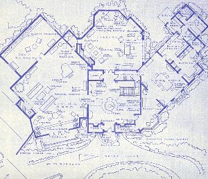
Mark Bennett, Home of Bruce Wayne & Dick Grayson,
Los Angeles-based artist Mark Bennett has meticulously created blueprint drawings of the apartments, offices, homes, and landscapes of American television situation comedies, ranging from the one-room apartment of Alice and Ralph Kramden (The Honeymooners), the Victorian home of Gomez and Morticia Addams (The Addams Family), Professor John Robinsons spaceship (Lost in Space), to the entire flora and fauna of Gilligans Island. Terrie Sultan, Curator of Contemporary Art at the Corcoran Gallery of Art, writes: As a child, Bennett was addicted to television, mesmerized by the way the happy, organized lives of families featured on Leave It To Beaver, Father Knows Best, or the Dick Van Dyke Show accomplished what his own family life could not. "I was trying to find a family and escape from reality," he says. "I watched the programs over and over, obsessively, and I especially loved the reruns because there were no surprises." During long hours of viewing, he familiarized himself with the minutiae of more than forty-five situation comedies, noting the location and appearances of such ephemera as furnishings, appliances, addresses, and phone numbers. It is in this detailing of such particulars as the "wooden hangers" and "lots of new clothes" in Mary Richards apartment (The Mary Tyler Moore Show) that gives Bennetts cool, diagrammatic architectural renderings the patina of collective memories. Two portfolios of lithographs published by Mark Moore Gallery and printed by El Nopal, Los Angeles will be presented in the hallway gallery, accompanied by two books by Bennett: TV Sets (TV Books, 1996), a compendium of 40 architectural renderings; and How to Live a Sit-Com Life (TV Books, 1997) Bennetts rule-book on the dos and do nots of re-creating the visual bliss of the perfect, and in the artists mind, attainable TV lifestyle. All exhibitions and related educational programs are free and open to the public. The Gallery welcomes individuals and groups for guided tours; please call 315 229-5174 for information. Gallery Hours
The Gallery will be closed October 16-18, 1997 for mid-semester break.
|
| © SLU, 2/3/98
Designed and maintained by: Carole Mathey St. Lawrence University, Canton, New York Last updated: Monday, May 14, 2001 |